Mastering linear regression in Excel can add a versatile analytical tool to your skillset, giving you the ability to make predictions about the relationship of dependent and independent variables. Though relatively simple to implement, linear regression—also known as regression analysis—is a powerful analytical technique with wide applicability across myriad business use cases.
Running a linear regression in Excel is a relatively straightforward technique that allows you to make real-world predictions by examining linear relationships between dependent and independent variables and the effect of those variables upon one another. This guide shows you how to unlock the predictive potential hidden within your datasets in four simple steps.
Linear regression is used for quantifying the relationship between an independent variable and a dependent variable, which enables you to make predictions for how real world scenarios might unfold. This ability serves a wide range of purposes in the business world.
For example, a sports drink company makes the reasonable assumption that its beverage sales are directly linked to the outdoor temperature of a given geographic sales region. The hotter the temperature, the more beverage units sold—in other words, regional beverage sales depend on the temperature of the given region. Based on this initial information, you could assign “beverage sales” to the y (dependent) variable—the target, or value you’re trying to predict—and “temperature” to the x (independent) variable.
Our example dataset aligns average daily temperatures with average daily sports drink sales during a given time period.
| Average Temperature (°F) | Sports Drink Sales – Noon (average/day) |
|---|---|
| 72 | 50 |
| 78 | 65 |
| 82 | 80 |
| 88 | 95 |
| 92 | 110 |
| 97 | 125 |
| 102 | 140 |
| 108 | 155 |
| 112 | 170 |
| 118 | 185 |
| 122 | 200 |
| 128 | 215 |
The goal is to make predictions based on historical data points by calculating and plotting out the trendline.
Mathematically, linear regression uses the easy-to-interpret formula listed below, followed by a detailed breakdown of what each of the formula’s variables represents:
y = a + bx
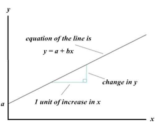
When plotted on a graph, the shape of a linear regression takes the form of a straight line with any valid slope value—essentially, the angle or direction at which the line banks:

The following steps show how to set up and run a linear regression in recent versions of Microsoft Excel. It’s possible in other spreadsheet tools like Google Sheets or Zoho Sheets as well—the steps are generally similar, but the details will vary.
Despite its simplicity, performing linear regressions in previous versions of Excel could be challenging, but more recent versions include advanced data analysis tools that make linear regressions easy.
Start by inputting your historical data into Excel. For our sports drink company example, enter the information from the dataset detailed above—your results should resemble the example below.

Next, plot your historical data using a scatter plot.
Your results should resemble the following example.
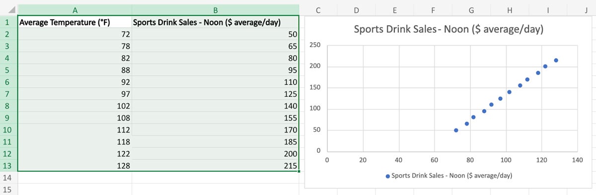
Even before placing the trendline, you can see that a highly consistent linear correlation between the variables is easily observable.
To complete your linear regression, you’ll need to draw the trendline against your scatter plot.
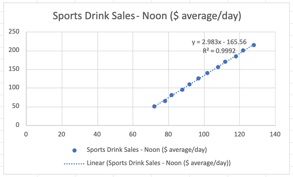
Because you elected to display the linear regression equation and the R-squared value, the results—listed below—are placed directly inside of the chart.
y = 2.983x – 165.56
R² = 0.9992
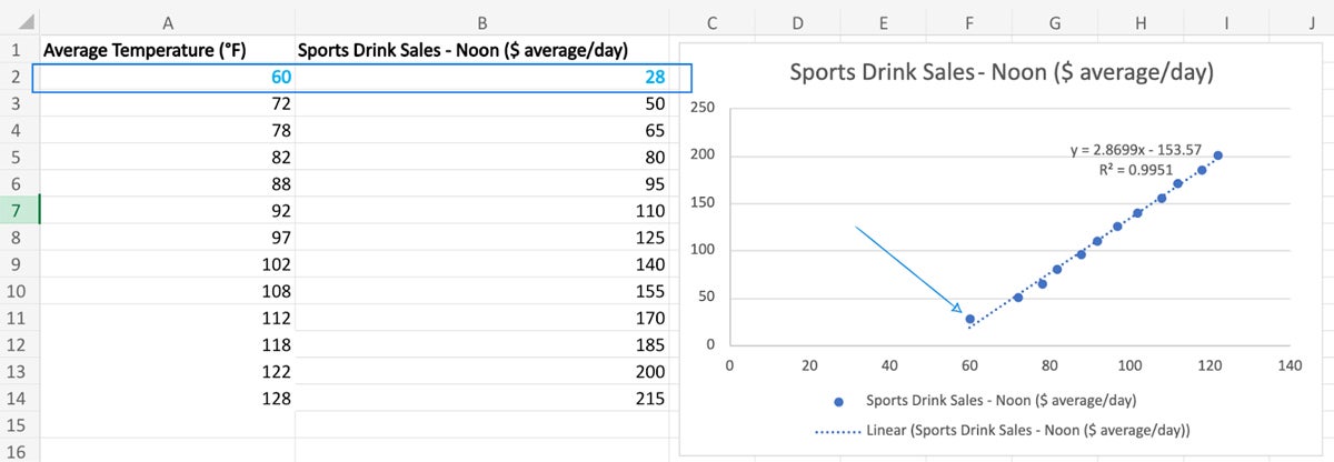
Using this equation, you can now calculate a sales number prediction by directly plugging in a value for x. For this example, we can predict sports drink sales for 65 °F weather.
y = 2.983(65) – 165.56
2. Solve the equation for y.
In this example, the value is 28, which means that in 65 °F weather we could expect sports drink sales of $28. You can verify this by plotting the new values into the original graph:
The R² value—also referred to as the coefficient of determination—indicates how well your data fits the regression model (goodness of fit). An optimal R² value typically is 0.9 or above, so your linear regression model has a high goodness of fit.
Simplicity and elegance come at a price, and linear regression formulas are not without their caveats. The general rule of thumb regarding sample size in the linear regression formula is a minimum of 10 to 20 cases per independent variable. If three independent variables are used, for example, a minimum sample size of 30 to 60 items is required for making accurate predictions.
When using linear regression, the following five conditions must also be true for results to be valid:
You can use common metrics to assess the performance of your linear regression model, including the R² value for measuring the proportion of variance explained by your equation, as well as mean squared error (MSE) or root mean squared error (RMSE) for quantifying the average squared difference between predicted and observed values.
You should use a linear regression formula when a linear relationship between the dependent and independent variables is observed or suspected in your dataset. Also, linear regression is ideal for predicting a continuous outcome when the previously mentioned assumptions are satisfied based on the nature of your data.
A simple linear regression takes one dependent variable and one independent variable and depicts their linear relationship with a straight line. On the other hand, multiple linear regression incorporates two or more independent variables to predict a single dependent variable, allowing for a more complex modeling of relationships.
Outliers can significantly influence the results of a linear regression, distort the estimated coefficients, and affect the trendline. Techniques like data transformation or robust regression methods can be employed to mitigate the impact of outliers.
Whether you’re looking to enhance your decision-making processes, optimize business strategies, or simply gain a deeper understanding of the data that surrounds you, linear regression in Excel allows data professionals to leverage powerful statistical tools in a ubiquitous, broadly familiar software tool. That said, you should also understand the limitations of unspecialized software; remember that while Excel is a convenient tool for basic regression analysis, it may lack some advanced features found in dedicated statistical software. Always interpret results cautiously, and consider using more specialized statistical software for in-depth analysis, if needed.
If you’re learning to perform statistical analysis using readily available spreadsheet tools, read our guide to running Monte Carlo simulations in Excel using five easy steps.

Datamation is the leading industry resource for B2B data professionals and technology buyers. Datamation's focus is on providing insight into the latest trends and innovation in AI, data security, big data, and more, along with in-depth product recommendations and comparisons. More than 1.7M users gain insight and guidance from Datamation every year.
Advertise with TechnologyAdvice on Datamation and our other data and technology-focused platforms.
Advertise with Us


Property of TechnologyAdvice.
© 2025 TechnologyAdvice. All Rights Reserved
Advertiser Disclosure: Some of the products that appear on this
site are from companies from which TechnologyAdvice receives
compensation. This compensation may impact how and where products
appear on this site including, for example, the order in which
they appear. TechnologyAdvice does not include all companies
or all types of products available in the marketplace.