Datamation content and product recommendations are
editorially independent. We may make money when you click on links
to our partners.
Learn More
Data visualization is a method of communicating complex data and information in a straightforward and aesthetically pleasing manner using graphics. It plays a pivotal role in decision-making by turning hard-to-understand datasets into visually comprehensible representations. By presenting information graphically, data visualization streamlines the identification of trends, patterns, and correlations that might otherwise remain hidden within your data.
There are many different examples of data visualizations that can be used to meet specific purposes or to suit varied datasets and analysis goals. These data visualization examples can be categorized into two major criteria: standard data visualization examples and creative data visualization examples. Becoming familiar with the different types of data visualization can help you choose the ones best-suited to your enterprise needs and objectives.
Standard data visualizations—those most commonly used in reports, presentations, and dashboards—are foundational tools for communicating data insights. The following examples of standard data visualization are some of the most popular across a wide range of industries:
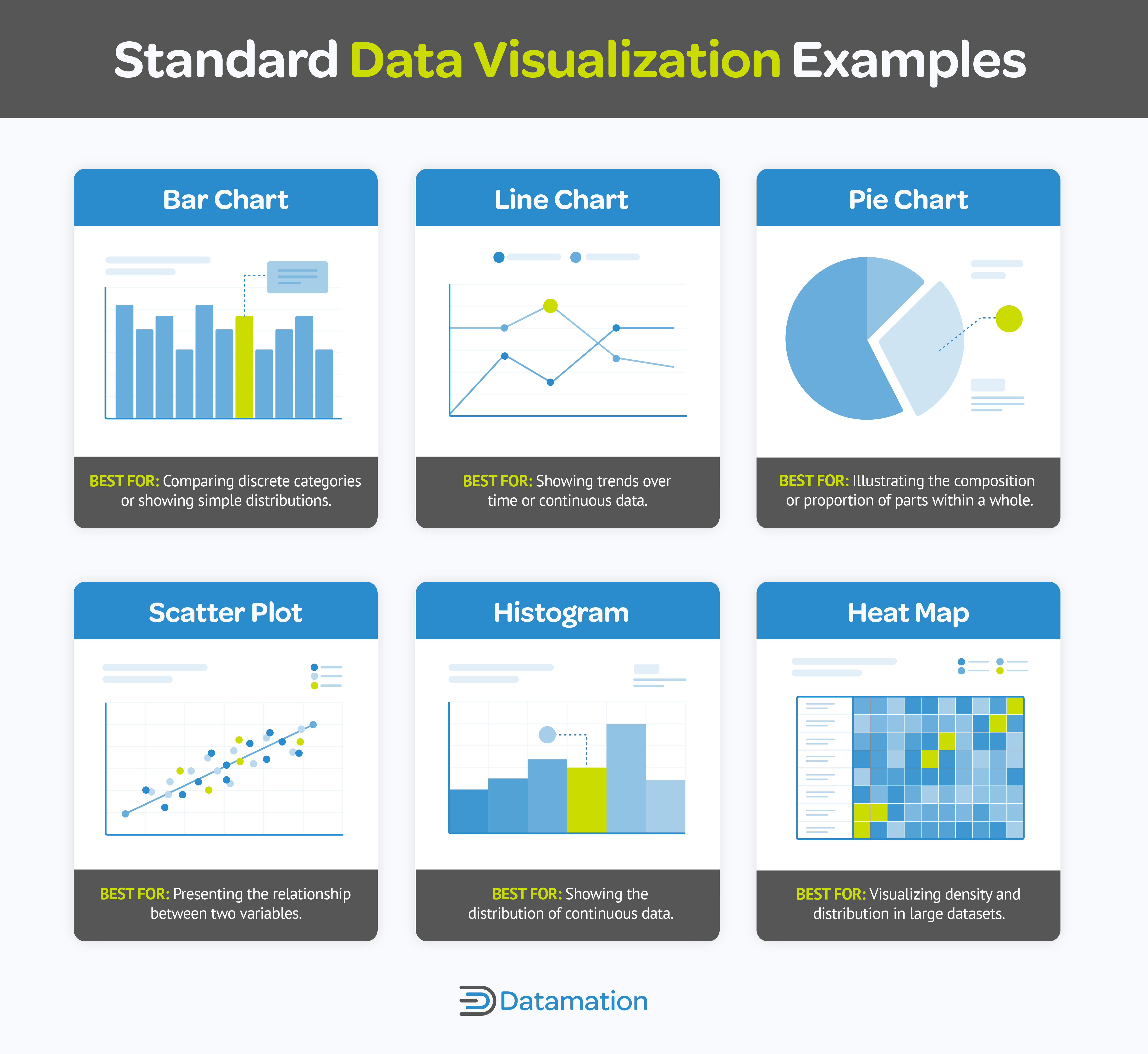
Standard data visualization examples include bar chart, line chart, pie chart, scatter plot, histogram, and heat map.
Bar Chart: This data visualization example is ideal for comparing discrete categories or showing simple distributions because of the ease of interpretation it provides. Bar charts are typically used in comparing sales figures for different products, for example, or visualizing survey responses by category.
Line Chart: These display data points often used to present trends over time or continuous data. They’re best suited for visualizing changes over time, like tracking stock prices, monitoring temperature variations, or illustrating population growth.
Pie Chart: Pie charts are useful for illustrating the composition or proportion of parts within a whole, simplifying understanding of a distribution of categories at a glance—for example, the allocation of expenses within a budget.
Scatter Plot: Scatter plots show individual data points as dots on a two-dimensional graph to reveal the relationship between two variables—for example, plotting the relationship between height and weight or examining the correlation between advertising expenditure and sales revenue.
Histogram: Histograms are excellent for displaying the distribution of continuous data, like the distribution of ages in a population or the distribution of income levels in a region.
Heatmap: Heatmaps use color gradients to represent data values in a matrix format and are effective for visualizing large datasets, such as user interactions on websites. Heatmaps can be beneficial in web analytics to display where users are clicking, scrolling, or spending the most time on a webpage, providing user behavior information to help you refine your website design and content layout.
Advertisement
Creative Data Visualization Examples
Creative data visualizations elevate the process of depicting data graphically to captivate audiences and make complicated information understandable and accessible.
Infographics
This infographic data visualization example from Venngage uses visual hierarchy and bold typography to emphasize key statistics. In addition, each piece of information is explained to give deeper insights, and relatable symbols, like the broken heart icon, add an emotional element.
This infographic data visualization from Venngage uses recognizable icons and statistical information to clearly convey data.
Power BI comes with features for designing static reports and dashboards, including a combination of visualizations, text boxes, and images for creating infographics. You can export these reports as static images or PDFs.
Interactive Data Visualizations
Interactive data visualization enables dynamic exploration of datasets. Unlike static images, interactive visualizations offer functionalities like zooming, filtering, and hovering over elements for additional information, enhancing user experience and facilitating discovery.
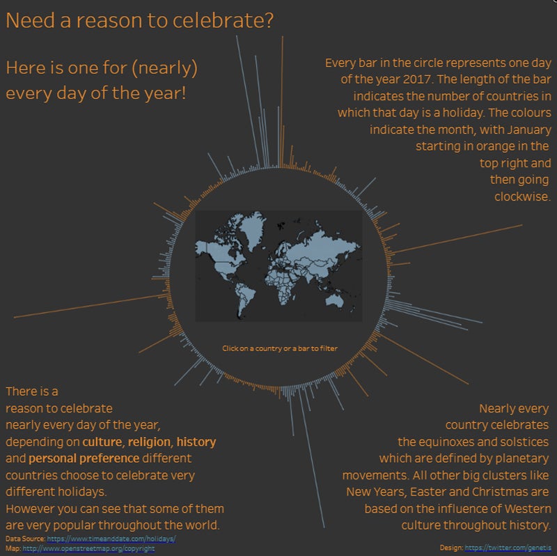
This interactive data visualization by Alexander Waleczek facilitates data exploration.
This interactive data visualization example on public holidays designed by Alexander Waleczek displays a global map showing public holidays celebrated worldwide. By selecting a bar, you can see which countries observe the holiday represented by that bar. You can also select a country on the map to view the holidays celebrated in that specific country. The bars radiating from the center adjust based on your selection, making the experience more compelling and informative.
Tableau has an intuitive and user-friendly interface that simplifies building complex visualizations with minimal coding or technical expertise. Its drag-and-drop functionality simplifies manipulating data and designing interactive dashboards.
Data Storytelling
Data storytelling visualizations artfully blend narrative storytelling with interactive and visual elements, guiding audiences through a cohesive and engaging story grounded in data. They follow a structured narrative arc, taking viewers on a journey through information or events, fostering a deeper understanding. Unlike interactive or infographic visualizations, data storytelling visualizations prioritize crafting a gripping story with a defined beginning, middle, and end.
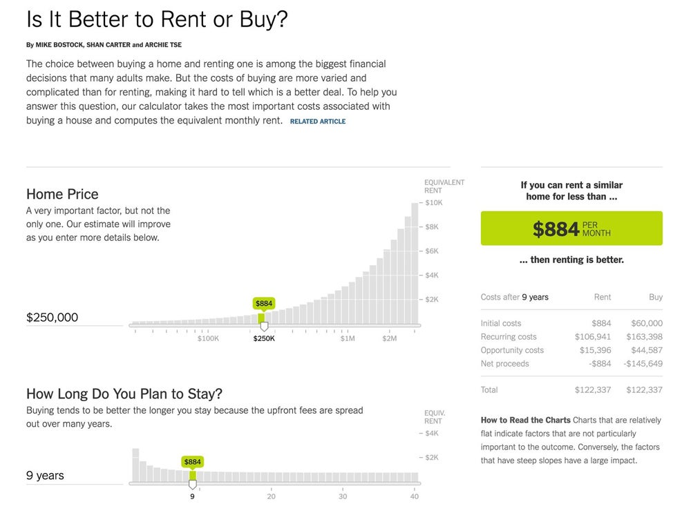
The Upshot’s data storytelling visualization has interactive elements and visual clarity, making it highly-engaging and informative.
This buy or rent data storytelling visualization from The Upshot compares the costs of renting versus buying over time, with visual representation that makes complex financial calculations easy to understand. This data visualization example is also interactive, letting you explore the data and see how changes in various factors could affect your personal decision on whether to rent or buy.
Toucan Toco is specifically crafted for data storytelling, prioritizing the narrative aspect of data visualization. With its Storytelling Studio, it offers users a suite of data visualization tools and templates finely tuned for creating sophisticated narratives around data. This focus enables users to effectively convey findings, trends, and key messages to their audience.
Advertisement
Effective Real World Data Visualization Examples
The ultimate goal of data visualization is to present information in a way that can be easily understood by users of any technical level. A well-designed data visualization presents complex information in an engaging, informative, and visually attractive manner—helping the audience understand data with a single glance.
The Pudding’s Film Dialogue
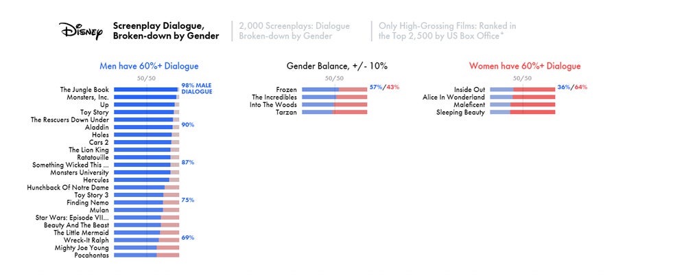
This data visualization from The Pudding uses familiar color-coding and contextual information, making it easy to understand data at a glance.
The Pudding’s Film Dialogue is one of the best examples of data visualization. Its interactive elements let you explore data in various ways, while its straightforward design and intuitive color coding make data easy to interpret. It also provides a detailed breakdown of dialogue percentages and contextual information about each movie and a narrative integration to guide viewers through the findings. This data visualization also reveals significant trends and changes in gender representation over time, making it insightful and user-friendly.
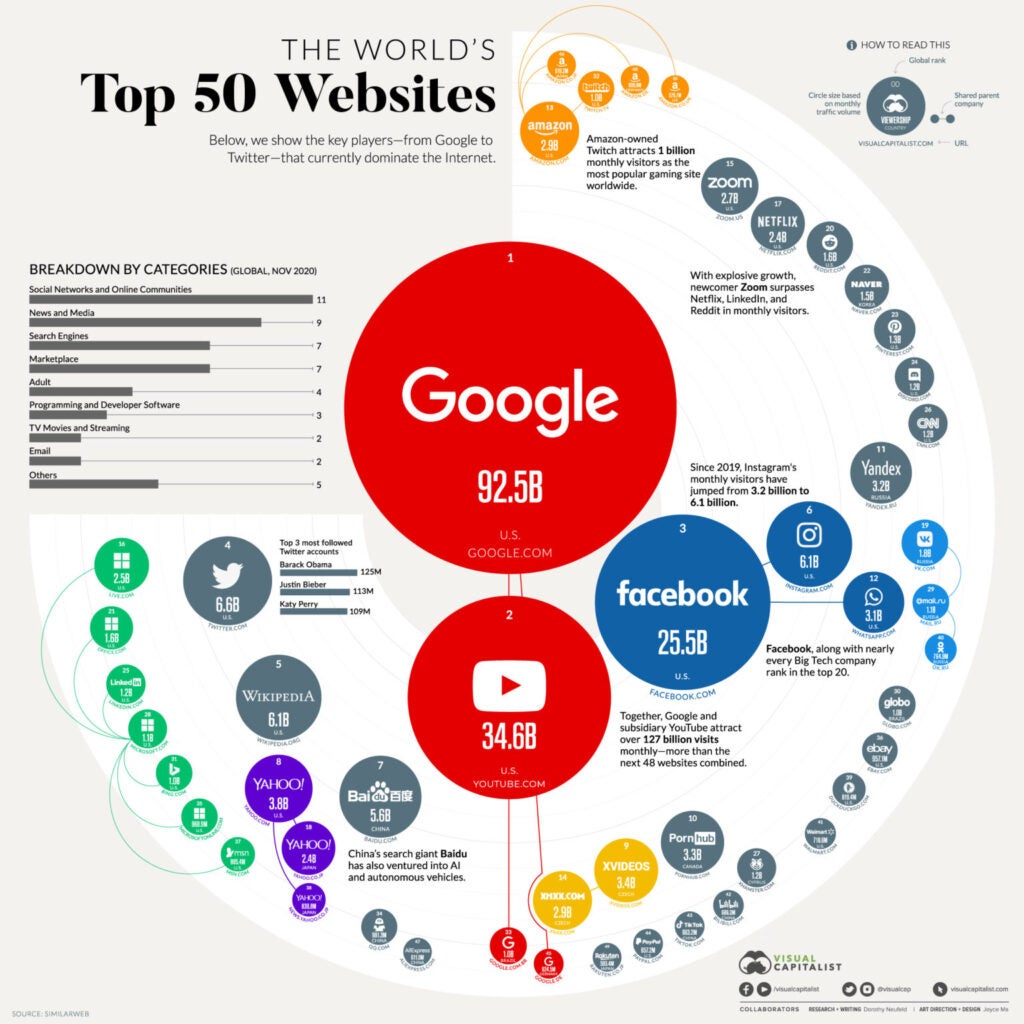
The World’s Top 50 Websites
The World’s Top 50 Websites from the Visual Capitalist effectively communicates data using simple design and size variation in its visual elements.
Visual Capitalist’s “The World’s Top 50 Websites” is an excellent example of data visualization that presents complex information in a simple and effective way. The design uses circles of varying sizes to represent the traffic each website receives, making it easy to compare their popularity. Additionally, different colors categorize websites into types, aiding in quick visual distinction.
The infographic offers relevant information about each website, including its category and traffic, creating a strong visual impact. The large circles representing popular websites like Google, YouTube, and Facebook immediately draw attention, underscoring their dominance on the internet. This infographic exemplifies the goal of data visualization: to present complicated data in an easily interpretable and understandable format.
Advertisement
Misleading Real World Data Visualization Examples
Even with all the necessary elements, data visualizations can unintentionally mislead if they erroneously represent the data. While these inaccuracies may seem minor, they can have serious impacts by leading to a skewed understanding of the data and flawed insights, potentially resulting in misguided business decisions.
Incorrect Chart Selection
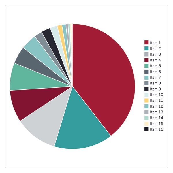
Some data visualizations don’t seem to make sense because of the wrong chart type—like when people misuse pie charts. Pie charts are most effective when displaying how components relate to the whole. However, when too many categories are included—as in the example below—the chart can become cluttered.
A pie chart is not ideal for presenting numerous categories because it can get crowded, as in this example from Harvard Business School.
To maintain clarity, it’s advisable to limit the number of categories to six or fewer. Exceeding this limit can result in an overcrowded chart, making it difficult to distinguish each segment and undermining its purpose of providing valuable insights.
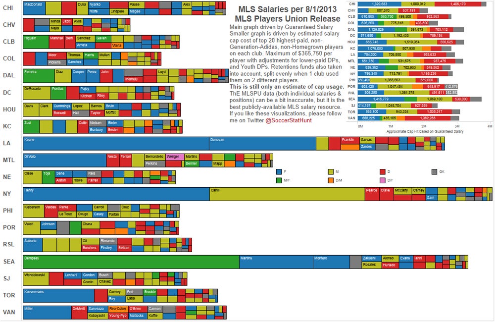
Too Many Variables
Having too many variables in data visualization can obscure patterns, introduce false correlations, and make it challenging to extract meaningful insights due to clutter and complexity.
This data visualization of MLS Salaries uses too many variables, making it overwhelming and hard to understand.
Focus solely on what’s necessary to convey your message and discard the rest. This approach supports enhanced data communication. Choose a format that presents the data unambiguously and concisely.
Poor Color Choices
Using the wrong color in a data visualization can lead to wrong interpretations. Similarly, too many colors in a single chart type—as in the example below—can lead to confusion, making it harder for viewers to interpret your data.
This Polymer’s data visualization example uses too many colors, which can lead to confusion.
Use a limited color palette to improve the clarity and comprehension of your data. Choose neutral colors for less critical elements and highlight crucial points with contrasting hues to guide the viewer’s attention. Steer clear of color combinations that run counter to widely accepted connotations (e.g., red for positive and green for negative). When selecting your color scheme, keep in mind individuals with colorblindness to ensure inclusivity.
Advertisement
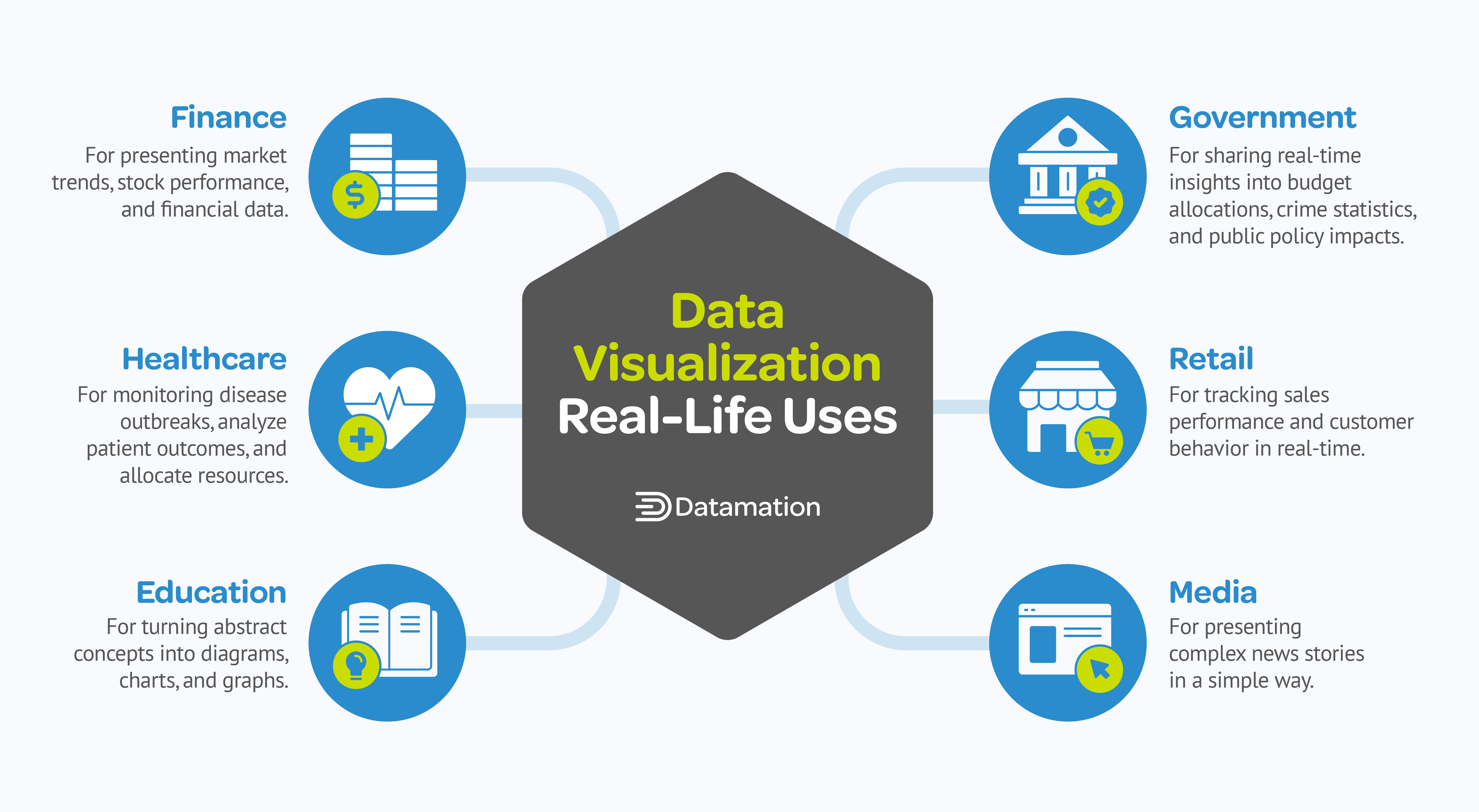
How Is Data Visualization Used In Real-Life?
Data visualization has transformed the way information is presented and interpreted in various sectors. It empowers you to translate complex datasets into visually engaging representations, leading to better comprehension and decision-making. The following applications show how it can be used in a wide range of fields:
Data visualization is used in finance, healthcare, education, government, retail, and media sectors.
Finance: Data visualization brings detailed market trends, stock performance, and financial data to life. With interactive dashboards, you can spot patterns and predict changes in the market, which can help you make smarter decisions about your investments.
Healthcare: Medical organizations leverage data visualization to monitor disease outbreaks, analyze patient outcomes, and allocate resources. Heatmaps and geographic visualizations help track the spread of contagious diseases and optimize healthcare services based on real-time data.
Education: Data visualization supports the learning process by turning abstract concepts into visually appealing diagrams, charts, and graphs. It makes complicated information more digestible for students to promote understanding.
Government: Governments use big data visualization to share real-time insights into various aspects such as budget allocations, crime statistics, and public policy impacts. This visual transparency fosters trust and strengthens civic engagement.
Retail: Retailers can monitor sales performance and customer behavior real-time with data visualization. Having access to vital information enables you to swiftly adapt strategies and gain a competitive edge.
Media: Media outlets use data visualization to present news stories in a compelling way. Infographics simplify complex data, making it easier for audiences to grasp essential data and stay informed about current events.
Advertisement
Frequently Asked Questions (FAQs)
When is Data Visualization not the Best Approach?
While data visualization is a powerful tool for communicating information, there are situations where it may not be appropriate or effective.
When the Data Is Insufficient
If you don’t have enough data to draw meaningful conclusions or if the data is too sparse to create a clear visualization, consider presenting the information through descriptive statistics like averages or percentages or through textual narratives that highlight key trends. This ensures that despite the lack of data, your audience still gains valuable insights without relying on potentially misleading visualizations.
When Presenting Highly Sensitive or Confidential Data
If the data contains sensitive or confidential data, like personal or proprietary information, it’s crucial to prioritize privacy and security concerns. In such cases, it’s best to refrain from visualization altogether. Instead, opt for textual summaries, aggregated statistics, or encrypted reports.
When the Data Doesn’t Support Visual Representation
If your data involves subjective, abstract, or qualitative elements, visualization alone may not be the best way to convey its nuances. For example, data related to emotions or opinions might lose some of its meaning when translated into visual formats. Use textual or descriptive presentation methods instead for a more accurate and meaningful way to communicate this type of data.
What Are the Basics of Data Visualization?
The basics of data visualization include:
Understanding Your Data: First and foremost, you must have a thorough understanding of your data, including its structure, dimensions, and characteristics. This involves data exploration, cleaning, and preprocessing for accuracy and relevance.
Choosing the Right Visualization: Selecting the appropriate type of visualization depends on the nature of the data and the insights you want to convey. For instance, bar charts are great for comparing quantities, while line graphs work well for showing trends over time.
Simplifying and Clarifying: Keep your data visualization simple and focused to avoid overwhelming the viewer with unnecessary detail. Remove clutter and non-essential elements to emphasize the most important information you want to convey.
Labeling and Annotation: Add labels, titles, and annotations to help viewers understand the data and the context of your visualization. Labels should be concise, informative, and positioned strategically for clarity.
Maintaining Design Consistency: Be consistent in picking colors, fonts, and formatting to create a cohesive and visually appealing presentation. Adhere to design principles such as contrast, hierarchy, balance, and alignment to enhance readability and visual impact.
Accessibility and Inclusivity: Make sure that your visualizations are accessible to all users, including those with disabilities or diverse learning needs. Use color-blind-friendly palettes and offer alternative text for images.
Advertisement
Bottom Line: Reinforcing Understanding Through Real-World Data Visualization Examples
Effective data visualization is a key step in the data analytics process and plays a major role in enabling informed decision-making across various industries. Without it, important insights won’t be communicated to stakeholders. Bad data visualizations lead viewers to misunderstand data, resulting in poor business decisions and even legal or regulatory ramifications.
The data visualization examples we tackled in this article aim to solidify your understanding of the significance of data visualization choices. By studying both good and bad examples, you’ll not only learn what makes a beautiful and insightful visualization but also identify potential pitfalls to avoid. By learning from these examples and staying updated on the latest data visualization trends, you can ensure your visualizations remain both relevant and impactful.
Learn and master data visualization by completing top-rated Coursera courses on the field. Read our guide on the Best Coursera Data Visualization Certificate Courses of 2024 to get valuable recommendations on choosing the right course and kickstart your journey toward being a data visualization expert.
Liz Ticong is a tech industry expert with hands-on experience in AI, software testing, and product analysis. Specializing in AI news, software reviews, and buyer’s guides, she rigorously tests and experiments with the latest AI and tech tools to provide in-depth, practical insights. As a contributor to eWeek and TechRepublic, she simplifies complex topics, helping readers make well-informed decisions.
Datamation is the leading industry resource for B2B data professionals and technology buyers. Datamation's focus is on providing insight into the latest trends and innovation in AI, data security, big data, and more, along with in-depth product recommendations and comparisons. More than 1.7M users gain insight and guidance from Datamation every year.
Advertiser Disclosure: Some of the products that appear on
this site are from companies from which TechnologyAdvice
receives compensation. This compensation may impact how and
where products appear on this site including, for example,
the order in which they appear. TechnologyAdvice does not
include all companies or all types of products available in
the marketplace.