Big Data visualization calls to mind the old saying: “a picture is worth a thousand words.” That’s because an image can often convey “what’s going on”, more quickly, more efficiently, and often more effectively than words. Big data visualization techniques exploit this fact: they are all about turning data into pictures by presenting data in pictorial or graphical format This makes it easy for decision-makers to take in vast amounts of data at a glance to “see” what is going on what it is that the data has to say.
Big Data visualization involves the presentation of data of almost any type in a graphical format that makes it easy to understand and interpret. But it goes far beyond typical corporate graphs, histograms and pie charts to more complex representations like heat maps and fever charts, enabling decision makers to explore data sets to identify correlations or unexpected patterns.
A defining feature of Big Data visualization is scale. Today’s enterprises collect and store vast amounts of data that would take years for a human to read, let alone understand. But researchers have determined that the human retina can transmit data to the brain at a rate of about 10 megabits per second. Big Data visualization relies on powerful computer systems to ingest raw corporate data and process it to generate graphical representations that allow humans to take in and understand vast amounts of data in seconds.
The amount of data created by corporations around the world is growing every year, and thanks to innovations such as the Internet of Things this growth shows no sign of abating. The problem for businesses is that this data is only useful if valuable insights can be extracted from it and acted upon.
To do that decision makers need to be able to access, evaluate, comprehend and act on data in near real-time, and Big Data visualization promises a way to be able to do just that. Big Data visualization is not the only way for decision makers to analyze data, but Big Data visualization techniques offer a fast and effective way to:
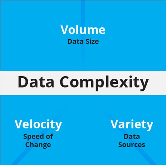
Like the graphic above, data visualization takes a complex array of data from many sources and makes it visually comprehensible.
The human brain has evolved to take in and understand visual information, and it excels at visual pattern recognition. It is this ability that enables humans to spot signs of danger, as well as to recognize human faces and specific human faces such as family members.
Big data visualization techniques exploit this by presenting data in visual form so it can be processed by this hard-wired human ability almost instantly – rather than, for example, by mathematical analysis that has to be learned and laboriously applied.
The trick with Big Data visualization is choosing the most effective way to visualize the data to surface any insights it may contain. In some circumstances simple business tools such as pie charts or histograms may reveal the whole story, but with large, numerous and diverse data sets more esoteric visualization techniques may be more appropriate. Various Big Data visualization examples include:
Linear: Lists of items, items sorted by a single feature.
2D/Planar/geospatial: Cartograms, dot distribution maps, proportional symbol maps, contour maps.
3D/Volumetric: 3D computer models, computer simulations
Temporal: Timelines, time series charts, connected scatter plots, arc diagrams, circumplex charts.
Multidimensional: Pie charts, histograms, tag clouds, bar charts, tree maps, heat maps, spider charts.
Tree/hierarchical: Dendograms, radial tree charts, hyperbolic tree charts.
The answer to this question is almost certainly “yes,” and here’s why. Big Data is all about collecting and keeping large amounts of data (rather than discarding it) because data storage is cheap and the value of the insights the data contains may be high.
There are a number of ways to analyze data, but the most effective – or indeed the only way – that some insights can be surfaced and exposed is through Big Data visualization.
In fact the amount of data that an organization stores does not need to be particularly large in order for it to benefit from Big Data visualization techniques: the periodic table is a perfect Big Data visualization example that clearly reveals otherwise -obscured relationships between just a hundred or so elements.
Big Data visualization can be an extremely powerful business capability, but before an organization can take advantage of it some key issues need to be addressed. These include:
A quick survey of the Big Data tools marketplace reveals the presence of big names including Microsoft, SAP, IBM and SAS. But there are plenty of specialist software vendors offering leading bog data visualization tools, and these include Tableau Software, Qlik and TIBCO Software. Leading data visualization products include those offered by:
Zoho Analytics: Focusing on ease of use – a particularly key attribute as data tools grow – Zoho analytics is a self service option. Meaning that users will not need the assistance of IT staff or professional data scientists to glean insight from data.
IBM Cognos Analytics: Driven by their commitment to Big Data, IBM’s analytics package offers a variety of self service options to more easily identify insight.
QlikSense and QlikView: The Qlik solution touts its ability to perform the more complex analysis that finds hidden insights.
Microsoft PowerBI: The Power BI tools enables you to connect with hundreds of data sources, then publish reports on the Web and across mobile devices.
Oracle Visual Analyzer: A web-based tool, Visual Analyzer allows creation of curated dashboards to help discover correlations and patterns in data.
SAP Lumira: Calling it “self service data visualization for everyone,” Lumira allows you to combine your visualizations into storyboards.
SAS Visual Analytics: The SAS solution promotes its “scalability and governance,” along with dynamic visuals and flexible deployment options.
Tableau Desktop: Tableau’s interactive dashboards allow you to “uncover hidden insights on the fly,” and power users can manage metadata to make the most of disparate data sources.
TIBCO Spotfire: Offers analytics software as a service, and touts itself as a solution that “scales from a small team to the entire organization.”
SEE ALL
Datamation is the leading industry resource for B2B data professionals and technology buyers. Datamation's focus is on providing insight into the latest trends and innovation in AI, data security, big data, and more, along with in-depth product recommendations and comparisons. More than 1.7M users gain insight and guidance from Datamation every year.
Advertise with TechnologyAdvice on Datamation and our other data and technology-focused platforms.
Advertise with Us


Property of TechnologyAdvice.
© 2025 TechnologyAdvice. All Rights Reserved
Advertiser Disclosure: Some of the products that appear on this
site are from companies from which TechnologyAdvice receives
compensation. This compensation may impact how and where products
appear on this site including, for example, the order in which
they appear. TechnologyAdvice does not include all companies
or all types of products available in the marketplace.